Basic WordPress Theme Guide
This is a brief explanation of what is needed for an awesome theme, well awesome from my perspective. This is good stuff, memorize it.
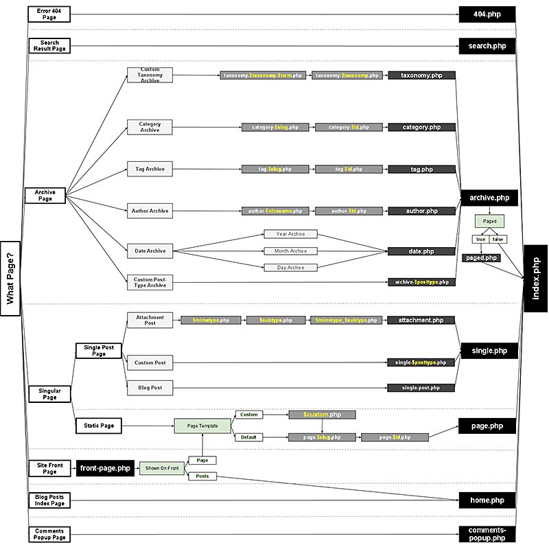
This is a visual representation of all the different types of templates that can be used in a theme, it's just for your reference, you can skip over it. Start at the left of the image, and go right.
Main Theme Templates
front-page.php- the Home Page -/single.php- a single post/article -/what-did-you-eat-on-thanksgiving/page.php- a single page -/about-us/category.php- a category page, usually a list of all the posts in a category -/category/seo/tag.php- a tag page, usually a list of all the posts tagged a certain tag -/tag/seo/author.php- an author page, usually a short bio and a list of all the posts written by that author -/author/mtom/search.php- search results page -/search/?s=thanksgiving404.php- error page displayed when someone mistypes a url -/aboup-us/
For several of those main types further customization is possible. This can let the designer do some cool things, like using a different color scheme on different categories, layout, or even totally different everything for different categories, authors, pages, etc..
single-{post_type}.php- If the post type were product, WordPress would look forsingle-product.php.page-{slug}.php- If the page slug is recent-news, WordPress will look to usepage-recent-news.phpcategory-{slug}.php- If the category's slug were news, WordPress would look forcategory-news.phptag-{slug}.php- If the tag's slug were sometag, WordPress would look fortag-sometag.phparchive-{post_type}.php- If the post type were product, WordPress would look forarchive-product.phpauthor-{nicename}.php- If the author's nice name were mtom, WordPress would look forauthor-mtom.php
For more reading, the codex.wordpress.org site is your friend, see: Theme Development
Theme Layout
In order to create fluid, flexible layout, this is how I do it (after years of reading and trial and error). The main thing for designers is that basically every page on the site will use the same header and footer, so keep that in mind when placing things like page titles, search forms, navigation menus, breadcrumbs, etc.. But also don't think too hard about it, with a flexible, fluid layout like this it frees the designer to be able to position things anywhere they want. Also cross-browser perfect.
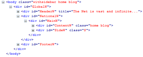
- body
- Global Container - for everything
- Header Container - for header
- National Container
- Main Container
- Content Container - for the main content area of page
- Side Container - for the sidebar
- Main Container
- Footer Container - for footer
- Global Container - for everything
CSS Developers
In Firefox using Firebug (if you aren't using firebug you are only using a fraction of your potential to be great) it looks like:
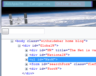
Each of the above (other than body) are divs, and all (including body) are position:relative;, which means anything within the div can then be absolutely positioned or floated within the div. Also the divs are overflow:hidden; to prevent anything from escaping. One of the examples of why is below:
Notice that the navigation (NavM) and the search form is on the top left of the page, they are both absolutely positioned within the GlobalW container. Doing layout like this gives you total control over the placement of things. Layout divs should have an id. That's the gist in a nutshell, to dive deeper use firebug on askapache.com.
I hope this helps explain what types of things are needed for a world-class theme, good luck!
« Questions I Ask Web Hosting Companies, Before BuyingThe Conscience of a Hacker – Hacker Manifesto »


Comments